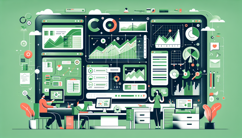
You can know exactly how to build a dashboard and how to make it interactive, and still end up with one nobody uses. The difference is design — not the formulas behind it, but the choices about what to show and how to arrange it. A dashboard is a communication tool first, and a beautiful chart of the wrong metric helps no one. This covers the design side: deciding who it’s for, choosing the few numbers that matter, laying out the screen, and the discipline of showing less so the important things land.
Start with the audience and their questions
Before placing a single chart, answer one question: who opens this, and what do they need to know in ten seconds? A dashboard for you is different from one for your manager or a client.
- ✓ Who opens this — you, a manager, a client, the whole team?
- ✓ What decision does it inform — and how often do they check?
- ✓ What are the 3–5 questions it must answer at a glance?
- ✓ What’s the one number they’d look at first if they only had five seconds?
Write down the three to five questions the dashboard must answer — “are we on track for the quarter?”, “which region is lagging?”, “how much budget is left?” — and let those drive everything. Every element earns its place by answering one of those questions; anything that doesn’t, however interesting, belongs on a detail tab, not the dashboard. This audience-first step is the one most people skip, and it’s why so many dashboards become a dumping ground of every chart someone could build rather than a focused answer to what the reader actually came for. Design starts with the reader, not the data.
Choose the few metrics that matter
The hardest design discipline is leaving things out. A dashboard with five well-chosen metrics beats one with twenty, because the eye can’t prioritize twenty.
For each candidate number, apply the “so what” test: if it changed, would anyone do anything differently? If not, it’s a vanity metric — interesting, not actionable — and it dilutes the ones that matter. Pick the handful of KPIs that actually drive decisions, and give them room. A useful frame is a few headline numbers (the “are we okay?” check) plus two or three supporting charts (the “why?”). Resist the urge to show everything you measured; the value of a dashboard is in what it chooses not to show as much as what it does. Restraint is the whole skill.
Lay out the screen for how people read
Layout is silent communication. The same charts arranged well or badly tell very different stories — bury the key number bottom-right and people miss it; lead with it and they can’t. Follow the reading pattern: scorecards across the top for the instant read, then charts grouped by theme below for the detail. Whitespace isn’t wasted space — it’s what lets each block register as separate. And keep the whole thing to one screen if you can, because a dashboard you have to scroll is two dashboards fighting for attention. Where the eye lands first should be where the most important answer lives. Alignment matters more than it sounds, too: charts and cards lined up on a tidy grid read as deliberate and trustworthy, while ones scattered at slightly different sizes and positions read as sloppy and make people quietly doubt the data. A few minutes spent snapping everything to a consistent grid does as much for how seriously a dashboard is taken as the numbers on it.
Show less, and let it breathe
Once the structure is right, the final design move is subtraction — removing everything that competes with the message.
- ✓ Hide the gridlines (View → Show → Gridlines) for a built-product look
- ✓ Limit the palette to one or two colors, plus a bold accent for what matters most
- ✓ Delete chart clutter — redundant legends, heavy borders, 3-D effects
- ✓ Keep it to roughly five to eight visuals; past that, nobody reads them all
A clean dashboard isn’t a stylistic preference — it’s functional. Every gridline, extra color, and unnecessary chart is visual noise the reader has to filter past to find the signal. Use one accent color to draw the eye to the thing that needs attention, and let everything else stay quiet. The test: glance at the dashboard for five seconds, then look away — could you state the headline? If not, there’s too much on it, and the fix is almost always to remove, not add.
The mistakes that sink a dashboard
Most failed dashboards share the same few design errors. Knowing them is half of avoiding them.
- ✗ Showing every metric you have, so none of them stands out
- ✗ Charts with no clear takeaway — pretty, but the reader has to work to find the point
- ✗ Dense little tables pasted on the dashboard instead of summarized into a visual
- ✗ No clear “most important” element, so the eye doesn’t know where to start
The thread through all of them is a failure to prioritize — treating every piece of data as equally important, which leaves the reader to do the prioritizing the designer should have done. A good dashboard makes a hierarchy: this matters most, this supports it, this is detail. If everything shouts, nothing is heard. When a dashboard feels off but you can’t say why, it’s usually this — too flat, with no visual sense of what to look at first.
Match each chart to its message
The last design choice is per-chart: the right visualization for each metric. A wrong chart type makes the reader work to understand what should be instant.
| To show… | Use |
|---|---|
| A comparison across categories | Column or bar chart |
| A trend over time | Line chart |
| A single headline number | Scorecard |
| Parts of a whole (few slices) | Pie — sparingly |
Use columns or bars to compare categories, a line for a trend over time, a scorecard for a single headline number, and a pie only for parts of a whole with a few slices. The guide to charts in Sheets covers matching chart to message in depth, and Google’s chart editor documentation lists every type. Title each chart with its takeaway, not its topic — “Revenue up 12%” beats “Revenue” — so even the chart labels do the reader’s work. Get the audience, the metrics, the layout, the restraint, and the chart choices right, and a dashboard built with the standard techniques and made interactive becomes something people actually open, trust, and act on — which is the only measure of a dashboard that matters.